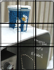
Probably the easiest way to dramatically improve your snapshots is to learn about the rule of thirds. You know, divide what you see in the viewfinder by two lines into thirds horizontally and vertically and try to get more interesting parts to roughly be either where the lines cross or on the lines themselves. If your picture did not come out like that, you can usually fix it later with a crop.
Rule of thirds is actually a rough approximation of the golden ratio which is very well explained at Wolfram’s website. The pictures will look even better if you will use lines that are conforming to the golden section.
Just a crack of a difference: fat lines are thirds, thin lines – golden mean (I did not use the plugin when I cropped the photo).

I was playing around today with a plugin that renders golden rectangles, spirals and triangles. I checked some of my old photos – many seem to follow golden mean rather than the rule of thirds.
I was also thinking about writing my own Photoshop plugin like that (that one does not look like it’s worth 32 bucks to me), but Adobe has draconian new rules about who gets the SDK. So instead I decided to write this post.
I ordered a book about golden mean and related stuff from Amazon. Helpful Amazonian electrobrain is suggesting the movie Pi. The dang thing is pretty smart.
Meanwhile I got kind of curious as to how appealing the golden rectangle actually is. Let’s see.
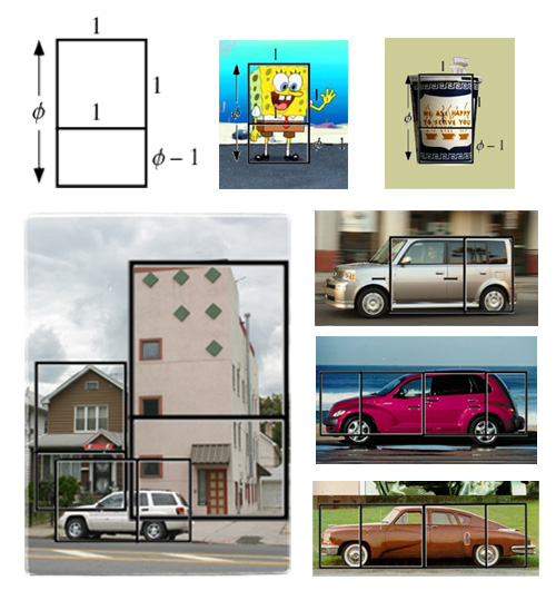
Things that are strangely appealing. Spongebob Squarepants. Yep, the golden section cuts straight across his weird little belt. It’s also interesting to note that he is almost always drawn kind of sideways – in front projection the proportion would be off.
The Greek cup (about which I wrote at length before and mentioned in probably the only poem which I ever wrote. Yep, it roughly conforms to the proportion and “to serve you” is right at the division.
Now, let’s see. Ugly things. That picture of one of the ugliest buildings in Brooklyn. It’s waaaaay off. And so is the SUV in front of it. The older house on the left is good though.
Cars are tricky though. The most beautiful car that I know is Tucker Torpedo. It does not fit a golden rectangle either. But it roughly fits two. I tried to fit two rectangles onto the SUV in the picture and to the Scion xB, which is jarringly boxy. No go. Let’s see, but Chrysler PT Cruiser, a car which I actually like, fits two rectangles also.
This is all terribly crude and unscientific, but might hopefully be useful to you.
